

The following publication has been lightly reedited for spelling, grammar, and style to provide better searchability and an improved reading experience. No substantive changes impacting the data, analysis, or conclusions have been made. A PDF of the originally published version is available here.
Are U.S. households carrying too much debt? Debt levels have grown recently to unprecedented levels. But that is nothing new, as debt has long been following an upward trend. Rising debt can be a good thing, signaling improved access to credit. For aggregates, what matters is net worth. That has risen in the late 1990s and fallen recently, but consumption had not kept up with the rise, and may not follow the fall.
Much concern has surfaced recently about the balance sheet of the household sector in the U.S. economy. One common worry is that households are excessively indebted and may be forced to cut back on their consumption, with negative consequences for economic growth. The purpose of this Chicago Fed Letter is to place this concern in perspective.
Record levels of debt
To do this, it is useful to look at both sides of the aggregate balance sheet of the household sector over a long period. Since total assets and liabilities are nominal amounts, we need to scale them so as to make them somewhat comparable over time. One method is to take such factors as inflation and population growth explicitly into account and look at per capita constant dollars. Another way, which turns out to give the same overall picture, is to measure assets and liabilities compared with gross domestic product (GDP), as in figure 1.
1. Assets and liabilities of the household sector
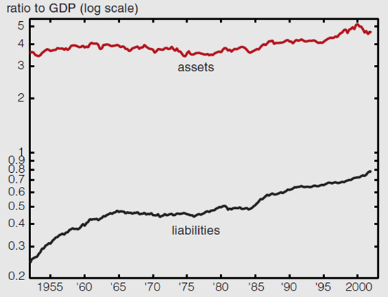
Figure 1 makes clear that the ratio of assets to GDP is roughly constant. This means that the value of assets grows over time at roughly the same rate as the economy. That is not true of liabilities, which have been growing steadily over the past 50 years, from 24% to 78%. As a result, the ratio of assets to liabilities has fallen from 14 to 6.
It is worth emphasizing that this growth of liabilities is not a recent phenomenon, but rather a secular trend. Thus, while it is correct to say that in the fourth quarter of 2001, household debt reached unprecedented levels, that is not, in fact, very newsworthy. The fact is household debt reaches record levels every other quarter on average (44% of the time to be exact). Thus, high levels of debt are not informative for current economic conditions. We may also note that the growth in liabilities has been uneven over time and distinguish three periods: an initial rise until 1965, then a period of stagnation until 1984, and another rise since 1984. In that last period, liabilities increased 62% relative to GDP, or 2.7% per year on average. Compared with this last figure, the growth rate of liabilities during the last five years (2.9%) is not out of the ordinary.
A final observation one can make is that both ratios display little or no cyclical pattern: They do not rise or fall markedly in recessions or in expansions. Of course, this could simply mean that the numerators and denominators of the ratios are moving together. Indeed, when one compares real rates of growth of liabilities and GDP, there is a relationship. But, as it turns out, the former is a lagging indicator of the latter. In other words, reductions of households’ liabilities follow rather than precede downturns. Nor are such high levels related to economic performance over longer time spans. For example, liabilities as a ratio to GDP remained about constant from 1965 to 1984 but increased 62% from 1984 to 2002. Yet the average annual growth rate of GDP was the same over these two periods (3.2%).
Debt is good
Debt has been growing steadily over time. That’s good news. Household debt is a means for households to transfer resources from times and circumstances in which they are less needed to those in which they are more needed. Typically, younger households have less resources than older households, yet they need housing just as much, if not more. They borrow to bring forward part of the future income they will enjoy in their prime and use it to buy a house now. Another example is the use of debt to make up for sudden falls in income and maintain a relatively stable level of consumption. In the real world, there are constraints on people’s ability to borrow, due to various informational and legal difficulties. Lenders may be reluctant to lend because they can’t be sure that borrowers will be able or willing to repay. In this context, a relative growth in indebtedness indicates that these constraints are being loosened, and that financial intermediation is becoming more efficient over time. In particular, an improved ability to borrow means that consumers can better plan their consumption and smooth it over time. Thus, shocks to income ought to have less of an impact on consumption than before.
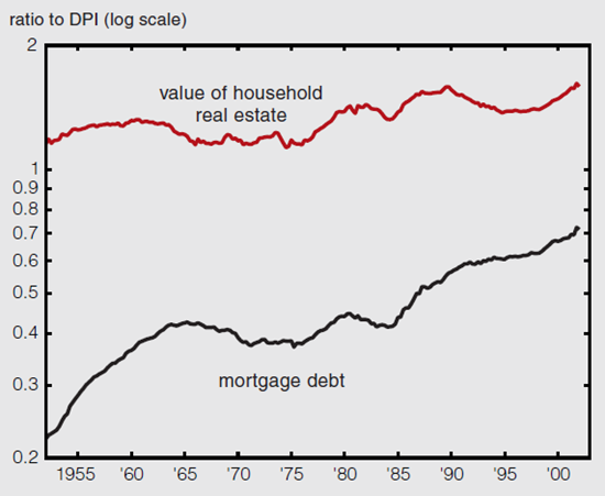
Household liabilities, as of the first quarter of 2002, are made up essentially of mortgage debt (67%) and consumer credit (21%). These shares have been relatively stable, and they tend to mirror each other. Since the 1970s, however, the share of mortgage debt has been growing. Since total debt itself has been growing, so has mortgage debt. Mortgage debt grew from 40% of disposable personal income in 1984 to 73%.
The increase in mortgage debt can be attributed to two factors. One is simply that the rate of home ownership has been increasing, from 64% in 1994 to 68% at the end of 2001. For those consumers who have switched from being renters to homeowners, the debt burden stemming from the mortgage merely replaces the rent they paid formerly. Thus, in terms of their budget, the increased debt burden puts no additional pressure on their consumption.
The other factor is the combination of smaller down payments on initial mortgages and increased use of home equity lines of credit, both of which represent greater access to credit. This allows homeowners to use their homes as collateral for the purpose of smoothing the variations in their overall consumption, over the life cycle as well as for other reasons. Figure 2 shows the value of household real estate and the value of mortgage debt, each as a ratio of disposable personal income. Because the scale is logarithmic, the difference between the two lines corresponds to the percentage of homeowners’ equity. The two lines are almost parallel in the last five years, indicating that this percentage has been stable. As house values have increased, so has mortgage debt in the same proportion.
2. Household real estate and mortgage debt
The bottom line is that consumers are indeed more indebted. I have given several reasons why this could be seen as a “good thing.” Nonetheless, a picture like figure 3, which shows the debt burden as a percentage of disposable personal income, might raise concerns. The data series provided by the Federal Reserve Board only go back to 1980. They show two major upswings in this debt burden; it now stands at 14.05%, not far below the previous peak of 14.38% in the third quarter of 1986. If interest rates rise abruptly, might consumers find this debt burden too high and then cut back on consumption?
It is worth keeping in mind at this point that, in a closed economy, one person’s liability is another person’s asset. If an event or a development has a negative impact on the debtor, it has a positive impact on the creditor. What counts for aggregate consumption is the net effect. In particular, increases in interest rates are just a transfer from debtors to creditors. Debtors reduce their consumption, but creditors increase theirs.
3. Household debt burden
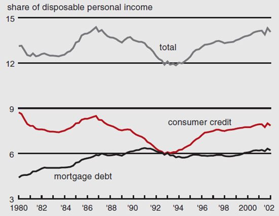
Arguably, such a transfer might affect the consumption level of debtors and creditors differently. Suppose, to take an extreme case, that the debtor is forced to absorb the increase in debt burden one-for-one through a cutback in consumption, but that the creditor increases consumption only fractionally: The difference represents a fall in aggregate consumption. This difference, however, is not lost to the economy as a whole. It will become an increase in saving (by the creditor) and, therefore, an increase in investment. Another concern is bankruptcy. If the debtor’s situation really worsens, they might default. In principle, however, defaults actually increase consumption, since they free up debtors’ income.
The other side of the sheet
Ultimately, consumers base their decisions on net wealth. If liabilities increase but assets increase even more, then consumers in the aggregate are wealthier and can spend more.
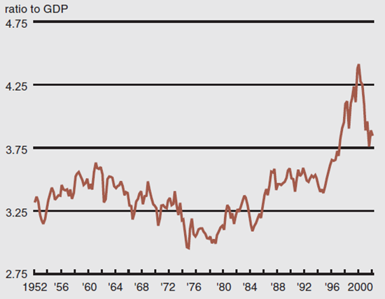
Household assets at the end of the first quarter of 2002 were around $48 trillion, about 4.6 times GDP. One-third of this is tangible, mostly real estate (28%) but also consumer durables (6%). The other two-thirds are financial—bank deposits (10%), bonds (4%), noncorporate equity (10%), directly held equity (12%), pension fund and life insurance reserves (20%), mutual fund shares (6%), and others (4%). Almost half of the last three categories consists of equity, indirectly held. All told, corporate equity (directly and indirectly held) represents 27% of assets, about $13 trillion as of the end of 2001. Liabilities total about $8 trillion, leaving net worth at $40 trillion, about 3.8 times GDP.
The share of equity in total assets has varied considerably over time, averaging 18%, and ranging from around 10% in the mid-1980s to a peak of 36% in 1999. In recent months, the market value of equity has fallen considerably. As a rule of thumb, one can divide the S&P 500 index by 40 to get the percentage share of equity in total assets, or by 33 for the effect on net worth. Figure 4 shows net worth relative to GDP, up to the end of March 2002. Using the rule of thumb, that ratio, which then stood at 3.84, would be around 3.57 at the end of July.
4. Net worth of the household sector
Substantial variations in the value of equity inevitably bring up the matter of wealth effects. Consumption is usually thought to be based on consumers’ perceptions of their long-term wealth, both human (as manifested through labor income) and nonhuman (or net worth). It is natural to think that consumption on one hand and labor income and net worth on the other should remain roughly in line over time. Researchers have found such a relation in the long run. Steindel and Ludvigson estimated the coefficient on net worth to be about 4.6%, based on data up to 1997.1 Using the most recently available data (up to the first quarter of 2002), the same methodology yields an estimate of 2.9%.
How can one explain this change? The answer is in two parts. First, it is imprecisely estimated in the data. Second, recent years have shown consumption to be abnormally low given the long-run historical relation between consumption and wealth. As a result, the relationship between consumption and wealth weakens if recent numbers are included. This departure can be illustrated by plotting the ratio of consumption to income against the ratio of wealth to income, as shown in figure 5.2 The last 22 observations (corresponding to the period 1996 to present) are plotted in black. The large upswing in the wealth–income ratio (rightward movement in the figure) was not accompanied by a corresponding increase in the consumption–income ratio (upward movement).
5. Nondurables and services consumption
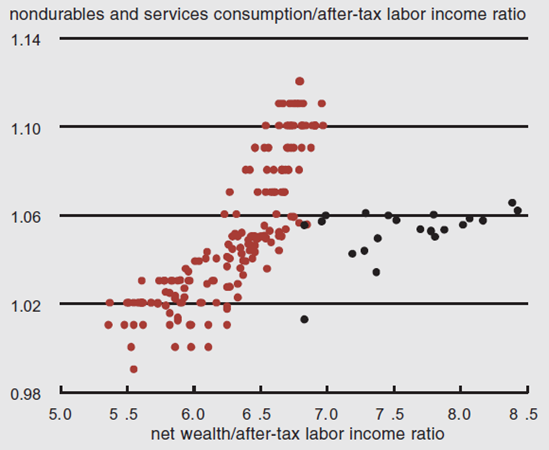
One way to read the figure is that, relative to their historical behavior toward their total wealth, consumers have ignored the run-up in their nonhuman wealth of the late 1990s.
A simpler but more vivid way to make this point is simply to ignore income and compare consumption and wealth directly, as shown in figure 6. The historical mean for this ratio since 1952 is 15.3%. The recent falls in wealth, which were accompanied by only a mild slowdown in consumption growth, brought the ratio to 15.1% as of the first quarter of 2002. Figure 6 provides a quick way to assess the import of further falls in net worth. Using the rule of thumb given above, a 200-point fall in the S&P 500, for example, would reduce net worth by 6%. If consumption remained at the same level, it would raise the consumption–wealth ratio to 16%, a number that can be compared with the historical record.
6. Nondurables and services to household net worth
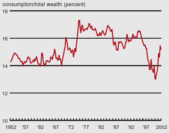
Source: Federal Reserve Board, Z1 Release.
Conclusion
Overall, neither the assets side nor the liabilities side of household balance sheets seems grossly out of line with the past. The reduction in wealth due to equity price movements appears to have brought wealth back in line with consumption. On the liabilities side, secular increases in debt should be placed in perspective against even greater increases in assets; this trend can be seen as evidence of improved intermediation, hence reduced dependence of consumption on income. The degree to which financial distress can affect aggregate consumption depends on the comparison between debtor and creditor behavior, and it is not obvious that high debt burdens (such as they presently are) signal an imminent curtailment of consumption.
Notes
1 Sydney Ludvigson and Charles Steindel, 1999, “How important is the stock market effect on consumption?” Economic Policy Review, Federal Reserve Bank of New York, July, Vol. 5, No. 2.
2 To be consistent with Ludvigson and Steindel, I plot the same measures of consumption (nondurables and services) and income (after-tax labor income). Using total consumption or disposable income yields similar pictures.


