A New Tool for Measuring the Convergence of Community Development and Public Health
Continuing efforts to facilitate opportunities for the community development and public health sectors to collaborate in order to maximize resources and impact, the Community Development and Policy Studies Division at the Federal Reserve Bank of Chicago introduces MeasureUp, an online application recently released by the Build Healthy Places Network that will help to communicate data across the two sectors. MeasureUp houses data from the Robert Wood Johnson Foundation, Community Commons, and PolicyMap, amongst others to enable practitioners, policy makers, advocates, and others to: 1) measure health-related impacts and picking individualized metrics using tried-and-true measurement tools; 2) use mapping tools to prioritize the needs of specific neighborhoods; 3) find evidence for the impact of collaborative work on health and well-being; 4) make the case to funders and investors; 5) read stories of success at the intersection of health and community development; and 6) identify opportunities for partnerships with organizations in other sectors.
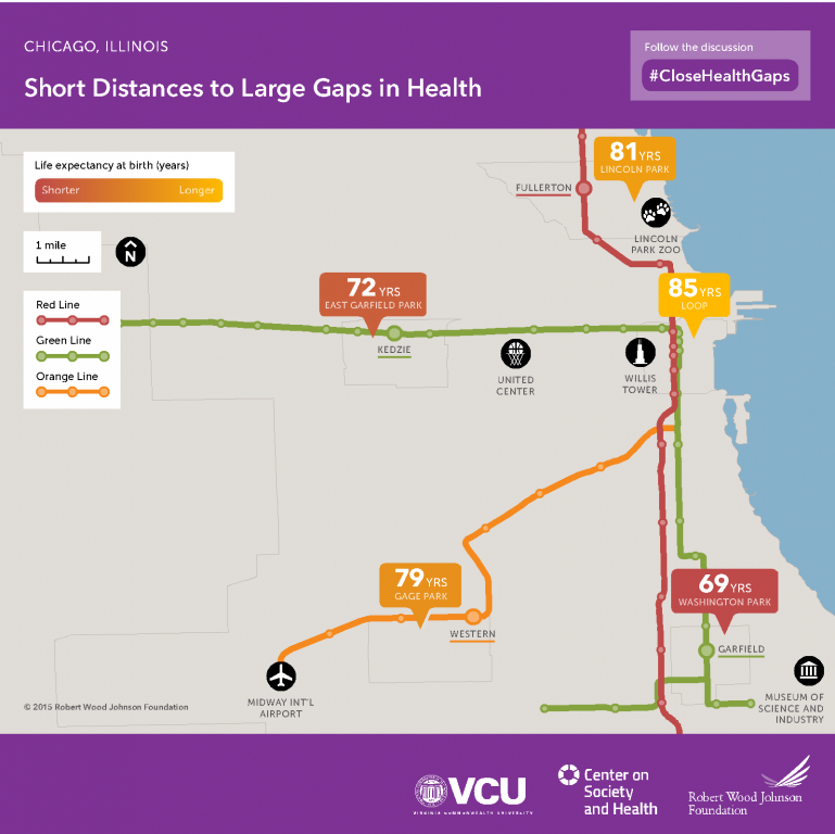
For example, below is map produced by the Center on Society and Health at Virginia Commonwealth University that documents life expectancy across various “L” transit stops in Chicago. Similar maps exist – or are in the planning stages – for other cities.
1. Life expectancy across "L" transit stops
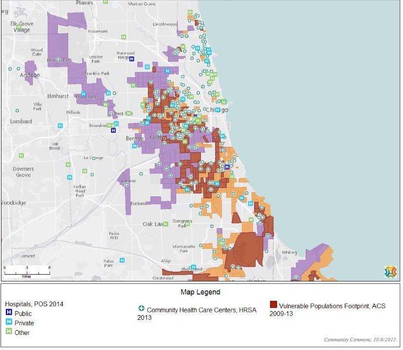
Another example is the map below, accessed through MeasureUp, created with data from Community Commons, which shows Chicago metro places where greater than 25 percent of the population does not have a high school diploma (areas in purple), where greater than 30 percent of the population is below the poverty level (light brown), and areas where both of those conditions co-exists (dark brown). Also indicated on the map are public hospitals (dark blue squares with “H”), private hospitals (light blue squares with “H”) and community health centers (green circles with a cross). (Green squares with an “H” indicate some “other” form of health provider.) Given that educational attainment and poverty are two primary indicators of vulnerability, this map provides an indication of where these areas of need exist in relation to health care facilities and where concentrations of population with low education and poor health indicate areas of need.
2. Education and poverty
Click here for other examples of how MeasureUp works.


