

Nearly 40 years ago, Congress passed the Community Reinvestment Act (CRA) to reduce discriminatory lending practices that prevented creditworthy borrowers from obtaining loans because of the neighborhood that they lived in or wanted to purchase a home in—a practice known as “redlining.” To effect change, the CRA directs and empowers financial regulatory agencies like the Federal Reserve to ensure that financial institutions provide fair access to credit to all borrowers.
With the Federal Reserve and other agencies currently considering how to improve and modernize the CRA, our recent research on the long-run effects of 1930s-era redlining maps shows just how critical this regulatory work is. The paper is the first study to use large-scale, quantitative methods to show a causal effect of redlining in neighborhoods across the United States.
Ultimately, we show that 1930s-era redlining maps have had decades-long consequences for affected neighborhoods, reducing home ownership rates, house values and rents while increasing segregation. Based on some back of the envelope calculations we estimate that redlining could account for 40 to 50% of the house value gap across affected neighborhoods from 1950 to 1980.
149 cities, thousands of neighborhoods, 100 years of demographic data
To uncover a causal relationship between redlining and economic outcomes, we study redlining maps in 149 cities, created in the 1930s by a now-defunct federal agency (the Home Owners Loan Corporation, or HOLC), that classified thousands of neighborhoods as credit-risk level A (least risky), B, C, or D (most risky, or red). In addition to housing and other economic characteristics, the ratings were influenced by the racial and ethnic makeup of neighborhoods and the share of residents that were immigrants.
Rigor of methodology plays a major role here. Because there were pre-existing differences across neighborhoods before the maps were drawn, we employ two strategies to ensure we can claim redlining—and not other factors—had a causal impact on economic outcomes in some neighborhoods.
Both of our strategies focus on very narrow areas around the demarcation lines between B and C neighborhoods and C and D neighborhoods where pre-existing differences are likely to be much smaller along the boundaries than the corresponding differences between the entire neighborhoods. The first strategy compares observed differences in these narrow areas across boundaries to the differences across other potential boundaries that appear statistically similar in terms of demographics and housing characteristics prior to the maps being drawn. The second strategy studies a subset of boundaries where there were little or no pre-existing differences or trends.
Using either approach, we find that residents living within a few blocks of the HOLC line on the “risky” side experienced much worse economic outcomes over time with respect to homeownership, house values, rents, and vacancy rates.
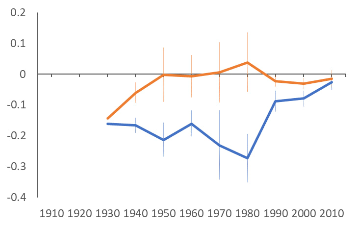
Share African American
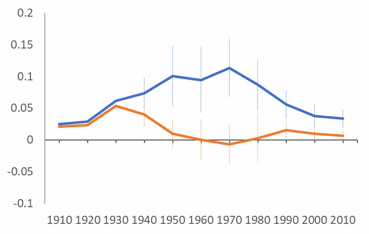
Home Ownership
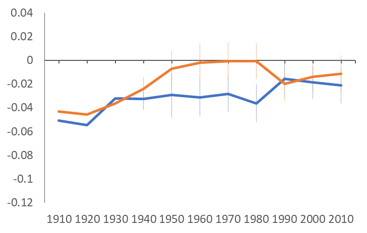
Log House Values
Segregation—and the emergence of “yellowlining” effects
The research also shows the extent to which redlining exacerbated racial segregation, with areas graded D (red) developing a higher share of Black residents than nearby areas graded C throughout the 20th century. Tellingly, segregation in D-rated areas rises until around the time the CRA, the Fair Housing Act, and the 1974 Equal Credit Opportunity Act were passed, at which point it begins to decline.
While much attention has rightly been paid to negative effects of discriminatory lending practices in the “red” neighborhoods rated the riskiest, the new research shows the impacts extended beyond these neighborhoods. In fact, we find that housing effects were larger and lasted slightly longer along the C–B boundaries (yellow lines) than along the D–C boundaries (red lines)—though why this occurred is still not fully understood and remains an important area for future study.
“Yellowlining” also exacerbated segregation in C–B neighborhoods. Though there were relatively few Black residents in either C or B neighborhoods before 1930, a meaningful gap in the share of Black residents began to grow after the redlining maps were drawn, with more Black residents living on the C side. That gap peaked at 8 percentage points in 1970 before gradually declining.
The importance of empirical research on historical policies like redlining
Over the past several decades, the “credibility revolution” in economics—recognized by this year’s Nobel Prize—has encouraged researchers to revisit classic questions in social science through more rigorous, empirical methods made possible by the availability of large datasets and advanced computing power.
This paper uses such approaches to move beyond descriptive analyses of redlined neighborhoods and show, empirically, that many poor economic outcomes in redlined—and yellowlined—neighborhoods didn’t merely occur alongside redlining, but were the direct result of it.
In doing so, the research pushes back against claims that the maps themselves played no direct role in disinvestment in redlined neighborhoods, or that those who created the maps were simply able to forecast the trajectory of U.S. neighborhoods.1
To learn more, download the full paper.
Notes
1 There is an ongoing debate among historians about the extent to which HOLC maps were shared with private lenders, thereby impacting their lending practices. However, there is clear evidence that the maps were shared with the Federal Housing Administration (FHA), and may have influenced where the FHA chose to insure mortgages. It’s also possible that the maps had long-run effects on neighborhoods by influencing many other aspects of urban policy but that remains unstudied to date.


